To download ColorTool, visit http://gis.cancer.gov/tools/colortool/ and follow the download link. You can download ColorTool 2.0 for ArcMap 9.2+ or ColorTool 1.4 for ArcMap 9.0 or 9.1. You will need to follow the Installation Instructions and then you will be ready to use ColorTool in ArcMap.
After embedding the ColorTool toolbar into your ArcMap environment, it should appear like this:
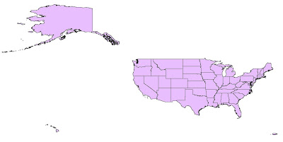
To demonstrate the different applications of the ColorBrewer tool, we will look at a simple map of the United States and create three different choropleth maps based on region, population density, and percentage of females. We will use different color schemes to better represent trends in our data. When the data and shapefiles are originally imported into ArcMap, the unsymbolized map of the U.S. looks like this:

For our first map, we want to represent the U.S. as nine distinct regions: East North Central, East South Central, Middle Atlantic, Mountain, New England, Pacific, South Atlantic, West North Central, and West South Central. To start the symbolizing process, click the ColorTool icon. If you haven't already added data in ArcMap, clicking on the ColorTool icon will prompt you to do so.
The ColorTool dialog box will pop up, and the first step is to select which layer you want to symbolize. For this map, we are symbolizing the "States" layer. For FieldName, we choose "Region". Note that only fields with numerical values will show up in the dropdown box. For the classification type, "Unique Values" is chosen and include values for Regions 1-8. The next step—choosing the color ramp type—is probably the most important. In this case, we are only dealing with numerical data in the sense that numbers assign a region to each state. We want to represent different states based on the classification of region. So, to create the primary visual differences between regions, we can choose a qualitative color ramp. The next step is to select the specific color ramp that will be used to classify the layer. Colors are listed alphabetically and the descriptive label is followed by the ColorBrewer text code in parenthesis. For this map, the color ramp "Dark Variety" is chosen. Clicking on the Colors control will flip the order of the colors within the ramp. Now, the outline properties for the regions can be selected—in this case, black with a width of 0.4 is selected. Outline properties can be customized to any color and width desired. Sometimes, a useful option will be to select Contrasting Greys so that the outlines around the colors are different shades of grey that will contrast with the colors they surround. The dialog box with the settings mentioned above looks like this:
Clicking Apply allows you to see the output of your color schematic before committing to the changes. Here is what our map of the regions of the U.S. looks like:

Finally, you can check your ramp suitability to see if your map is color blind friendly, photocopy friendly, LCD projector friendly, laptop (LCD) friendly), CRT friendly, or color printing friendly. If there is a red "X" over one of the boxes, you can adjust your Color Tool properties until it no longer appears.
For our second map, we will create a map that shows the population density of the states in the U.S. The layer we are working with is still "States", but now we choose the field name "POP07_SQMI". For Classification type, Quantiles is chosen. For this map, a sequential color ramp is most appropriate. A sequential color ramp is suited to ordered data that progresses from low to high (or vice versa), and population density fits into this category. The final output has a color ramp from Light Red to Dark Red, with Contrasting Greys as the outline. You can see that the New England region has some of the most dense populations, while the Mountain region has some of the least dense populations.

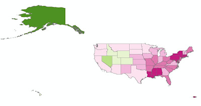
The final map we will create will use the "% Females" as the field. To represent male/female populations, we will use a diverging color ramp. This type of color ramp is most suitable to use when there is a range of values with a distinct boundary between the low and high values. In this example, we will use 50% as the middle boundary, so that all the values above 50% will represent a female majority and all values below 50% will represent a male majority in the state. Unfortunately, ColorTool does not allow you to set 50% as the critical middle value. You are limited to selecting from the Classifications in the dropdown box (Quantile, Jenks, Equal Interval, and Unique Values). However, you can still go ahead create a map based on a quantile classification, and choose your desired color scheme. Then, in ArcMap, right click on the "% Females" layer and go to Properties. Under Quantities, and Graduated Colors, you can manually adjust the ranges of each color so that 50% will be represented by a neutral color (white), and the values on either side of 50% will graduate toward different colors. In this example, the states with the largest percentage of female population represented by a dark pink, and the states with the largest percentage of male population are represented by a dark green.

For more detailed information about the ColorTool2.0 application and its features, visit the online help system provided by the National Cancer Institute. A link for the help system is also located on the bottom of the Color Tool dialog box when you open it in ArcMap.
