The GIS/Data Center will be closed December 24 through January 1. Regular hours will resume on Monday, January 4, 2010. The blogging staff will also be taking a break and this will be the last post until mid-January. In the meantime, enjoy this story about how religious institutions around the country are using GPS to catch those notorious Nativity scene thieves.
Happy holidays!
Monday, December 21, 2009
Friday, December 18, 2009
Fun Friday: The Map of Springfield
The Simpsons, one of the most well-known families in America, live in the town of Springfield. As anyone who has ever watched the show knows, this town has bloomed and blossomed into an extremely complex television town since its creation in 1989. Just check out this interactive map adapted by Adrien Noterdaem from the original made by Jerry Lerma and Terry Hogan. Here you can find out more than you ever wanted to know about the Simpson’s hometown. This detailed map shows the location of what seems like very shop, prison, gorge, apartment, park, and mountain ever mentioned, and includes pop-up images of dozens of locations around the town as they would appear on the show (see the screenshot below of Springfield Elementary School). Explore the world of the Simpsons for yourself through Lerma and Hogan's Guide to Springfield USA.


Thursday, December 17, 2009
Thursday Data: 2009 TIGER/Line Shapefiles
The updated TIGER/Line shapefiles for 2009 have been released by the U.S. Census Bureau. TIGER/Line shapefiles are most commonly used as geographic boundaries for corresponding tabular data from the U.S. Census Bureau; however, they also include features such as roads, rivers, and landmarks. The 2009 release includes boundaries for the 111th Congressional Districts along with 15 new state-based shapefiles including Metropolitan/Micropolitan Statistical Areas and 3-Digit and 5-Digit ZIP Code Tabulation Areas. Be aware that different shapefiles are available at the national, state, and county levels.
Wednesday, December 16, 2009
Web Wednesday: UK CrimeMapper
The National Policing Improvement Agency and the UK Home Office have collaborated to create an interactive online map that is available to the public and offers detailed crime statistics in England and Wales. The map allows users to see where and when crime has occurred (some down to the street level), make comparisons with other areas, and learn how crime is being tackled by their local neighborhood policing team.
The map was launched on October 20, 2009. This national map comes after 43 police forces in the UK successfully launched regional crime maps. The regional maps drew a lot of attention, and the national map was even more popular than expected. In fact, the server crashed on the morning of October 20th due to high demand.
Giving the public access to this information is viewed in a positive light by many. It engages communities in the police force's crime prevention process and it can even encourage people to set up neighborhood watch schemes. However, representatives from the Royal Institution of Chartered Surveyors (RICS) consider the publication of crime statistics as "sensationalist" and warn that the publishing of this information may have adverse effects on real estate values in high crime areas.

Map of Recent Crime Activity in England's Shropshire Division
The interactive map is available online and allows you to search for crime statistics by entering a village, town, or postcode, by selecting a police force, or by choosing a district on the map. The map gives you access to information about the trends of crime activity over the past year, and also allows you to see the types of crimes that have been committed in a certain area (crime types include burglary, robbery, vehicle crime, violence, and antisocial behavior). Within a selected area, the map will be divided into sub sections with a light grey representing low crime levels and darker greys indicating higher crime levels. This allows for comparison of crime activity between neighborhoods. Selecting a police force also gives you access to information about policing priorities.
In addition to highlighting high crime areas and perhaps lowering the real estate value of homes within those areas, some argue that this map also exposes areas of relatively low policing. Giving the public access to policing information could possibly assist criminals in developing more evasive strategies.
In addition to highlighting high crime areas and perhaps lowering the real estate value of homes within those areas, some argue that this map also exposes areas of relatively low policing. Giving the public access to policing information could possibly assist criminals in developing more evasive strategies.
Tuesday, December 15, 2009
Tuesday Tools: TypeBrewer
In a past blog post, we explored the use of the ColorBrewer tool, and how color selection affects the overall look and feel of a map made in ArcMap. Selecting appropriate typographic features, such as font size and style, is also very important when practicing good cartography. The map design tool called TypeBrewer allows a user to explore different typographic options in a map environment. Using this tool, you can select different type styles so you can observe the visual impact of font size, style, density, and tracking on the overall appearance of your map. This simple tool uses principles of cartography and is a quick way to apply different typographic alternatives and see which fits best for your map.
TypeBrewer is a flash-based interface tool that can be found here. Version 8 or higher of Adobe Flash Player is required to interface with TypeBrewer. Font schemes that are arranged online can be exported as a template in Adobe Illustrator or a specification sheet that lists all the data onscreen can be printed. Then, your selected font scheme can be applied to your map in ArcGIS. The TypeBrewer tool is best utilized in the beginning phases of your project so you can set design specifications before creating your map.

One of the limitations of TypeBrewer is that you can not manually add or substitute your own fonts into the schemes. However, you can select between different classic, formal, informal, and contemporary style labeling groups that are provided. You can select these styles based on on how elegant, professional, historical, or modern you want your map to look.
Monday, December 14, 2009
Miscellaneous Monday: Visualizing the U.S. Electric Grid
You're likely familiar with commercials and debates about the inefficiency of the current U.S. electric grid. It's been part of a larger discussion about energy conservation and greener methods of energy production. The idea some have had is that the U.S. wouldn't need to produce so much electricity if less power were lost in the power grid.
NPR has tracked this debate in its series "Power Hungry: Reinventing the U.S. Electric Grid." One feature in this coverage has been the "Visualizing the U.S. Electric Grid" series of maps.

These maps feature numerous layers that can be turned on and off and which depict such information as current and proposed major power lines, which states depend more on which sources of power, where power plants using different power sources can be found, solar power potential, wind power potential, etc.
Friday, December 11, 2009
Fun Friday: Middle East Geography Quiz
Test your geographic knowledge of the Middle East with this interactive Geography Quiz developed by Rethinking Schools.


Thursday, December 10, 2009
Thursday Data: GADM Database of Global Administrative Areas
Even if you have access to GIS software, you may not have access to relevant vector data. This is especially true when mapping those parts of the world that don't hold the corporate headquarters of companies that make the GIS software. Vector data of any quality can be hard to find for free online, and even items of data that aren't free aren't necessarily good.
Enter the GADM Database of Global Administrative Areas. GADM is attempting to compile high-resolution spatial data for every country down to the smallest administrative boundaries. Oh yeah, and it's free.
It's also not nearly complete, and there are some errors, but the amount of data they have is as impressive as its quality, and users publicly comment to let GADM know what errors they've found in the data so they can be ironed out. Take the following spatial data:


Both shapefiles are of Jamaica. The one on top--the one with very little coastal detail--is part of the countries shapefile that comes with the ArcGIS 9 ESRI Data & Maps 9.3 release in 2008. This data isn't exactly free. The bottom shapefile comes free from GADM. And look, it even has tiny little islands! And it isn't just a difference in coastlines, as GADM is attempting to provide equally detailed boundaries within each country to the smallest administrative levels.
Wednesday, December 9, 2009
Web Wednesday: CommunityWalk
CommunityWalk is an up and coming web app that allows users to create, save, and share maps. The original purpose of the site was to allow a realtor to mark and display the homes that she had for sale, but since then the site and application have grown into much more. Now each and every public user can create an array of personal maps to save, share, or publish.
CommunityWalk is a self proclaimed “Mapping Made Easy” application. From the home page users can link to everything that the site has to offer: basic map creation; the site’s blog; all CommunityWalk public maps; all CommunityWalk public professional maps; most popular wedding areas and much more.
To get started, you can either register for an account with CommunityWalk [visit CommunityWalk registration], allowing you to create maps for private use, or you can jump right in and create a public map. To create your own map head over to Start Your Map and input any location across the globe that you would like to map. Next, you can decide if you would like to publicly publish your map (making it available across the site and in various other search engine), sharable (meaning that only those who you provide with a site link can view your map), or completely private (only available if you are registered with the site). Then just title your map and get to work.
A bare map will be displayed on your screen and from here you can do various things from adding markers at special locations (searchable by name, address, or latitude and longitude) to displaying paths or line segments between points or even uploading pictures associated with your points of interest. Once you create your map masterpiece, click on the “share/export” link and use one of the options to display your map to the world. Below you can see all of the various options available under each of the three map editing tabs (Build This Map, Map Settings, and Share/Export).

Another nice feature of this site is that it has a few detailed tutorials to walk users through the steps of some of the more advanced options that are available, including adding audio to your map, linking directly to markers on your map or even creating your own icon image markers.
Below you can see a map we created displaying Rice University’s campus and a path line showing how to get from Fondren Library to the Houston Zoo, Houston Museum of Natural Science and Rice Village. Check out the features of the Rice University map including images for each of the markers and quick links to directions to or from any of the locations.

Tuesday, December 8, 2009
Tuesday Tools: MapShaper
Have you ever had a shapefile whose features were so detailed that it looked messy and detracted from the message you were trying to convey? When creating aesthetically pleasing maps, it is important to use shapefiles with a level of detail appropriate to the scale of the map. For example, a map of the entire United States does not need to show every tiny bend in the rivers that demarcate state borders; however, those bends may be significant in a detailed map of a small town that lies along the state border.
There are two primary GIS techniques, called simplification and smoothing, that can be used to alter the appearance of shapefiles. ArcGIS features both the Simplify and Smooth tools, which are included in ArcToolbox in the Data Management toolbox, under the Generalization toolset. Unfortunately, these two tools are only available at the ArcInfo license level, precluding many ArcGIS users from having access to them. (The GIS/Data Center does have a limited number of ArcInfo licenses available for patron use.)
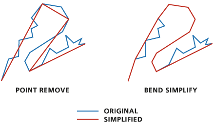
The simplify tool reduces the number of vertices in the original data, resulting in a smaller and more manageable file with a lower resolution. This tool is especially beneficial when modifying shapefiles for online GIS applications, where display time and processing time can be important. It is important to note that this method is most appropriate for eliminating detail that is not required when the image is zoomed out. When zoomed in closely, simplification often results in features that look even worse than the original. Below is the image from the ESRI Support Center illustrating the two simplification methods available in ArcGIS.
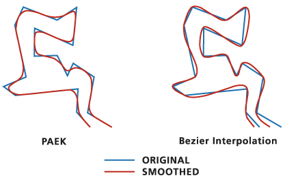
The smooth tool smooths out sharp corners that are often the result of limited data sampling. In contrast to the simplify tool, the smooth tool may actually create more vertices and more detail than was in the original shapefile, so it may not be desirable for web applications, but can be beneficial for creating aesthetically pleasing maps of detailed regions. Below is the image from the ESRI Support Center illustrating the two smoothing methods available in ArcGIS. Note that the Paek method smooths out and removes the peaks at each vertex, while the Bezier method maintains all vertices, but smooths the lines connecting them.
While the two ArcGIS tools are helpful, they can be tedious to use, because switching methods and levels of simplification requires exporting numerous iterations of shapefiles, comparing them all in a map document, and remembering what settings were used. In other words, you cannot visually see which settings you like the best without first exporting the shapefile.
Mark Harrower (of the UW Cartography Lab) and his former student, Matthew Bloch (who now creates great interactive maps for the New York Times website), created an online Flash-based application, called MapShaper, that brings these same tools to the public in a free format that is far more intuitive to use than the existing ArcGIS tools. Currently, MapShaper only features a simplify tool, though a smooth tool may become available in the future. You are also limited to uploading shapefiles smaller than 80MB, which is more than sufficient for most general work. The beauty of MapShaper is that you can see the results in real-time as you adjust the simplification method and level using a simple radio selection button and slider bar. As a result, you can preview your selections before exporting, allowing you to export only once you are satisfied with the output.

In order to test out MapShaper, we selected a shapefile of Canada, because the jagged coastlines of the numerous islands in northeastern Canada often cause the country outline to look much thicker and messier in that region than along the Hudson Bay and the U.S. border. In addition, there is extremely little development in that region, so it is highly unlikely that anyone interpreting the map would require a great level of detail there. Below is an image of the original shapefile of Canada.

After importing the Canada shapefile into MapShaper and simplifying it 75% using the Special Visvalingam method, notice that the entire border now has a uniform appearance regarding the line weight of the country border.

Since MapShaper only outputs the simplified .shp and .shx files, the .dbf file (and any other accompanying files) from the original shapefile must be copied and renamed to match the new output shapefile before it will be usable.
But what happens if the simplification causes you to loose detail in an important area of your map? For example, in the map below showing the vertices of numerous ocean inlets, imagine that fishing piers were located on the top and bottom inlets. Simplification of the coastline would remove all the inlets, causing the fishing piers to look like they were on land.

Conveniently, MapShaper allows you to remove or lock individual vertices before simplification, for fine-tuned manual control over the simplification process. In the image below, we have marked the vertices of the inlets that we want removed (shown in orange) and marked the critical vertices of the inlets that we want to keep (shown in red).

Now, when we increase the simplification level, the removed inlets disappear, the top and bottom inlets remain in simplified form, and the inlets that were not marked either way become much shorter and less detailed.

There are two primary GIS techniques, called simplification and smoothing, that can be used to alter the appearance of shapefiles. ArcGIS features both the Simplify and Smooth tools, which are included in ArcToolbox in the Data Management toolbox, under the Generalization toolset. Unfortunately, these two tools are only available at the ArcInfo license level, precluding many ArcGIS users from having access to them. (The GIS/Data Center does have a limited number of ArcInfo licenses available for patron use.)
The simplify tool reduces the number of vertices in the original data, resulting in a smaller and more manageable file with a lower resolution. This tool is especially beneficial when modifying shapefiles for online GIS applications, where display time and processing time can be important. It is important to note that this method is most appropriate for eliminating detail that is not required when the image is zoomed out. When zoomed in closely, simplification often results in features that look even worse than the original. Below is the image from the ESRI Support Center illustrating the two simplification methods available in ArcGIS.
The smooth tool smooths out sharp corners that are often the result of limited data sampling. In contrast to the simplify tool, the smooth tool may actually create more vertices and more detail than was in the original shapefile, so it may not be desirable for web applications, but can be beneficial for creating aesthetically pleasing maps of detailed regions. Below is the image from the ESRI Support Center illustrating the two smoothing methods available in ArcGIS. Note that the Paek method smooths out and removes the peaks at each vertex, while the Bezier method maintains all vertices, but smooths the lines connecting them.
While the two ArcGIS tools are helpful, they can be tedious to use, because switching methods and levels of simplification requires exporting numerous iterations of shapefiles, comparing them all in a map document, and remembering what settings were used. In other words, you cannot visually see which settings you like the best without first exporting the shapefile.
Mark Harrower (of the UW Cartography Lab) and his former student, Matthew Bloch (who now creates great interactive maps for the New York Times website), created an online Flash-based application, called MapShaper, that brings these same tools to the public in a free format that is far more intuitive to use than the existing ArcGIS tools. Currently, MapShaper only features a simplify tool, though a smooth tool may become available in the future. You are also limited to uploading shapefiles smaller than 80MB, which is more than sufficient for most general work. The beauty of MapShaper is that you can see the results in real-time as you adjust the simplification method and level using a simple radio selection button and slider bar. As a result, you can preview your selections before exporting, allowing you to export only once you are satisfied with the output.

In order to test out MapShaper, we selected a shapefile of Canada, because the jagged coastlines of the numerous islands in northeastern Canada often cause the country outline to look much thicker and messier in that region than along the Hudson Bay and the U.S. border. In addition, there is extremely little development in that region, so it is highly unlikely that anyone interpreting the map would require a great level of detail there. Below is an image of the original shapefile of Canada.

After importing the Canada shapefile into MapShaper and simplifying it 75% using the Special Visvalingam method, notice that the entire border now has a uniform appearance regarding the line weight of the country border.

Since MapShaper only outputs the simplified .shp and .shx files, the .dbf file (and any other accompanying files) from the original shapefile must be copied and renamed to match the new output shapefile before it will be usable.
But what happens if the simplification causes you to loose detail in an important area of your map? For example, in the map below showing the vertices of numerous ocean inlets, imagine that fishing piers were located on the top and bottom inlets. Simplification of the coastline would remove all the inlets, causing the fishing piers to look like they were on land.

Conveniently, MapShaper allows you to remove or lock individual vertices before simplification, for fine-tuned manual control over the simplification process. In the image below, we have marked the vertices of the inlets that we want removed (shown in orange) and marked the critical vertices of the inlets that we want to keep (shown in red).

Now, when we increase the simplification level, the removed inlets disappear, the top and bottom inlets remain in simplified form, and the inlets that were not marked either way become much shorter and less detailed.

Monday, December 7, 2009
Miscellaneous Monday: Spring Short Course Schedule
The GIS short course schedule for the Spring 2010 semester is now available online!
Each semester, the GIS/Data Center at Rice University offers introductory short courses on a variety of GIS topics. Each course lasts 1-2 hours and provides a topic overview along with hands-on training using ArcGIS 9.3 software. All courses are free and open to Rice students, staff, and faculty. Members of outside government, academic, research, or non-profit organizations may be permitted to attend if space allows. For scheduled course dates, check out our course calendar. To register, use our online registration form.
Each semester, the GIS/Data Center at Rice University offers introductory short courses on a variety of GIS topics. Each course lasts 1-2 hours and provides a topic overview along with hands-on training using ArcGIS 9.3 software. All courses are free and open to Rice students, staff, and faculty. Members of outside government, academic, research, or non-profit organizations may be permitted to attend if space allows. For scheduled course dates, check out our course calendar. To register, use our online registration form.
Friday, December 4, 2009
Fun Friday: Sin Maps
What is the greediest region in the United States? Where will you find the most individuals that indulge their lusty desires? A team from Kansas State, interested in making a splash at the annual Association of American Geographers’ meeting, created a series of maps to answer these questions and more. The team conducted a study titled "The Spatial Distribution of the Seven Deadly Sins within Nevada", first defining, then displaying the distribution of each of the seven deadly sins across the state of Nevada. However, in order to put the data into a more universal context, the team took their research a step further and applied their statistics to the entire nation.
The researchers defined each of the seven deadly sins as follows (click on the link for each of the sins to get a close up view of their respective distributions): greed (average income compared with number of people living below the poverty line); envy (total thefts [robbery, burglary, larceny, and grand theft auto] per capita); lust (number of STD cases reported per capita); gluttony (number of fast-food restaurants per capita); sloth (expenditures on art, entertainment, and recreation compared with employment); wrath (number of violent crimes (murder, assault, and rape) per capita); pride (an aggregate of the other six offenses—suggesting that pride is the root of all sin). The team then took statistical data for each of their defined sins and displayed it on a map, ranking the states from "saintly to devilish".

Though this information is extremely subjective (how does one really quantify a deadly sin?), the Kansas State researchers came up with a well-defined sin index, gave the viewer a chuckle and left to door open for continued research (think about changing the definition for each of the sins, analyzing each of the states on a smaller scale, or even extending the scope to other countries across the globe).To read more about the team and their Seven Deadly Sins project, check out this article from the Las Vegas Sun, "One nation, seven sin".
Thursday, December 3, 2009
Thursday Data: CIA World Factbook
The CIA World Factbook is operated by the U.S. Central Intelligence Agency. Not only does it offer numerous maps and country-by-country information, it also provides world-wide data for download for use in tables (and subsequently for GIS). Data categories include geography, people, economy, communications, transportation, and military. The data is updated every 2 weeks and rank orders countries by the data type (e.g. population highest to lowest).
You can search the website for data, but it may be better to just download the whole Factbook (with or without PDF reference maps). Once the files ares downloaded and extracted (from zip), you can search through the files for the data you want. Data files are stored as both html and text.
Unfortunately, the file for each data table (e.g. population, GDP, etc.) is labeled only with a number, and there isn't a table (at least not one this blogger could find) explaining which number matches up with which data. For instance, the file 2001rank.html gives GDP by country, but you don't know that until you open it.
What's probably the easiest way to find what you need is to open the rankorder folder--where the data files are kept--and open the file rankorderguide.html. Then you can choose which data category to look under (say, economy), then the specific data you want (say, GDP). The rank order is shown in html, but you can click "download data," which gives a text friendly format you can copy into a simple text editor, save, and then import into Excel.
If you haven't seen it already, check out the Tuesday Tools entry to see Factbook's new KMLFactbook web app, which allows you to create Google Earth friendly KML files catered to the Factbook data you choose.
Wednesday, December 2, 2009
Web Wednesday: Google Maps API
Ever wonder how to embed Google Maps in a website? One answer is use a Google Maps API (API stands for Application Programming Interface). There are actually several of these applications created by Google that can be used free of charge (so long as the user abides by the terms of agreement).
One API is designed to work with JavaScript, while another is designed for Flex developers to work with Flash (the developer must already have Flex). Both of these apps allow users to not only see what content you've added, but also to zoom in and out from the parameters you set. For example, you might set the original map parameters to marked real estate in one part of Houston, while the dynamic nature of the maps lets users zoom out to see more general location within the city and zoom in to see parks and schools. A third API, one not requiring experience with JavaScript, can be used to create "static" maps--that is, maps that show display markers, routes, polygons, etc over Google Map content, but that cannot be zoomed in/out. Instead of loading JavaScript or Flash content, this API simply loads an image file of a map, containing your added contents and cut to the parameters of your choosing.
Google says that all you need to get started is an API key (for free) which you can get once you have a (free) Google account. Then check out the developers' guide to learn how to get started.
Tuesday, December 1, 2009
Tuesday Tools: KMLFactbook.org
The CIA World Factbook (see this week's Thursday Data entry), operated by the the U.S. Central Intelligence Agency, makes available both maps and frequently updated data--economic, health, demographic, etc.--for most countries. Factbook has now come out with KMLFactbook--a web app that lets you download data in KML format for 2D or 3D display in Google Earth (Google Earth is free but must be downloaded).

Choose what type of data to search (e.g. "People"), then choose the specific data you want to have displayed (e.g. "Total fertility rate"). Choose a color option and either 2D or 3D, then preview the data in the embedded Google map viewer (the preview is 2D only). Then download the data for use in Google Earth (the screen shot below is of the KML in Google Earth Pro):

Freegeographytools blog piece
Subscribe to:
Posts (Atom)