Ordnance Survey (OS) mapping service has used lasers deployed from air and land to create an extremely detailed 3D map of the UK resort city Bournemouth, in the county of Dorset. OS claims the map is the most detailed map ever produced, surpassing 3D offerings from names like Google Earth and Microsoft Visual Earth. The company plans to expand its 3D mapping to the rest of the UK in the next several years.
YouTube video of map fly-through:
Telegraph.co.uk article (with youtube video embedded)
Ordnance Survey story
Monday, November 30, 2009
Friday, November 27, 2009
Fun Friday: Where Does Thanksgiving Dinner Grow?
"When far-flung families get together for Thanksgiving dinners, much of their food will have logged more miles than their relatives and friends around the table," according to the Worldwatch Institute, who recently released a new study titled Home Grown: The Case for Local Food in a Global Market.
Linda Zellmer, a Government Information and Data Services Librarian at Western Illinois University, has created a series of maps showing where many of the common ingredients in a traditional Thanksgiving meal are grown. The maps were created with GIS using data obtained from the 2007 Census of Agriculture, as discussed in yesterday's post. Check out all of her Thanksgiving Maps & Posters on her website. She even provides downloads of the data she used, so you can try creating your own maps! (Click on the map below to see the original.)


Linda Zellmer, a Government Information and Data Services Librarian at Western Illinois University, has created a series of maps showing where many of the common ingredients in a traditional Thanksgiving meal are grown. The maps were created with GIS using data obtained from the 2007 Census of Agriculture, as discussed in yesterday's post. Check out all of her Thanksgiving Maps & Posters on her website. She even provides downloads of the data she used, so you can try creating your own maps! (Click on the map below to see the original.)
Curious how these individual maps might add up together, we downloaded Linda Zellmer's data and created a summary map of all the Thanksgiving crops. While most crops were measured in acres harvested, turkeys were measured in shear number and wheat was measured in bushels harvested, making a direct sum of all crops difficult. Instead, we calculated the fraction of each crop grown in each state and summed those fractions to create a Thanksgiving Food Production Index of sorts, symbolized in six classes using natural breaks, resulting in the map below. For example, if one state grew 10% of the sweet potatoes, 2% of the turkeys and 4% of the wheat, it's index score would be 0.16. Since the index is a fairly meaningless number on its own, a legend was not included.

To account for the enormous difference in size between Texas and Rhode Island, we then took the Thanksgiving Food Production Index and divided by the area of each state, resulting in the map below. Though Massachusetts, New Jersey, and Delaware may not account for a large percentage of crops, due to their small size, their percentage of crops per area is just as big as the largest state producers.

So where did your Thanksgiving dinner grow? While California, Wisconsin, and Tennessee seem like likely candidates, the answer could be just about anywhere in the U.S. or even abroad. There are definitely severe economic and environmental implications of transporting food such long distances; however, there is something appropriate to the Thanksgiving spirit that the food on your one table could have been harvested from every state in the country.
Thursday, November 26, 2009
Thursday Data: Census of Agriculture
Most of us are familiar with the U.S. Census that tracks characteristics of our population, such as age, race, and income, but did you know there is also an agricultural census that will tell you how many acres of asparagus were harvested, how many turkeys were sold, how much money was spent on fertilizer, or the percent of farms with high-speed internet access?

The Census of Agriculture website provides public access to data to answer these questions and more. Every five years, the National Agricultural Statistics Service of the United States Department of Agriculture (USDA) conducts the Census of Agriculture, which generates a complete count of farms and ranches in the U.S. Data is also collected on crops, livestock, economics, and farm operators. Over the next few years, special interest reports will become available on irrigation, specialty crops, organic production, on-farm renewable energy production, aquaculture, and land economics.
In addition to downloading the 2007 Census of Agriculture Full Report, website visitors can use Quick Stats 2.0 Beta to quickly query the data and download the results in tabular form to be imported into GIS software, or even map the results directly within the Quick Stats browser interface.

For those without access to GIS, the Agricultural Atlas contains maps of all of the data tables in the Census. Historical census publications are also available on the website dating back to 1840.
Check back tomorrow for some fun maps created using the 2007 Census of Agriculture data!
Wednesday, November 25, 2009
Web Wednesday: Solar Boston
Solar Boston is a program started by the Mayor of Boston, Thomas Menino, to increase the amount of solar energy in the city. The Solar Boston website displays yet another internet-based use of ArcGIS. Residents of Boston, Massachusetts have opportunity to view all of the solar energy producers in their city (as well as a few other alternative energy sources) and determine the solar potential of their own home or business. Simply use the "Tools" tab to type in a Boston address and a graph of the solar potential for the year will appear. The application also provides information on the assumptions that were made to arrive at such solar potential values and outlines how one should actually go about implementing solar energy solutions.
Take a look at the Solar Boston map and test it out for yourself! [Try using the solar potential tool on the address " 666 Boylston St ", the location of the City of Boston Central Library, as we did below.]

Take a look at the Solar Boston map and test it out for yourself! [Try using the solar potential tool on the address " 666 Boylston St ", the location of the City of Boston Central Library, as we did below.]

Tuesday, November 24, 2009
Tuesday Tools: Scribble Map
The Scribble Map web app lets users create custom maps by adding custom content to Google Maps. Users can add lines, markers, shapes, text, and web images, all the while controlling factors like line thickness, feature opacity, font selection, and color, etc.

When you're done, send the map to a friend via email or Facebook. You can save your map online for future revisions, save the image as a jpeg, save the map as a KML, or open the map with Google Maps or Google Earth.
Scribble Map doesn't provide all the options and functionality found in a more complicated GIS software, such as ArcGIS--e.g. you can geocode with Scribble, but not batch geocode, and the app offers no geoprocessing functions. But Scribble Map lets you create nice-looking, custom maps without the time required to learn and use more complicated (and expensive) GIS software. (Also see the freegeographytools.com blog post.)
Monday, November 23, 2009
Miscellaneous Monday: Holiday Hours
The GIS/Data Center will be closing early at 3:00pm this Wednesday and will be closed this Thursday and Friday. Regular hours will resume on Monday, November 30.
GDC Thanksgiving Hours
11/23/09 9:00am - 5:00pm
11/24/09 9:00am - 5:00pm
11/25/09 9:00am - 3:00pm
11/26/09 CLOSED
11/27/09 CLOSED
GDC Thanksgiving Hours
11/23/09 9:00am - 5:00pm
11/24/09 9:00am - 5:00pm
11/25/09 9:00am - 3:00pm
11/26/09 CLOSED
11/27/09 CLOSED
Friday, November 20, 2009
Fun Friday: Ohio is a Piano
Cartographer Andy Woodruff has developed an interactive map that capitalizes on the fact that Ohio has 88 counties- the same number of keys on a piano. The basic premise behind Woodruff's map is this: each of the musical notes associated with the 88 piano keys are assigned to a single county in Ohio. The result is a "musical map" that is very interesting and fun to experiment with. Notes can be assigned to counties based on a selected attribute. For instance, if the attribute chosen is square miles, the county with the lowest square mileage will be assigned the lowest frequency note that can be played on a piano and the county with the highest square mileage will be assigned the highest frequency note.

Once the notes are assigned according to an attribute, the map allows you to play a song, play the data, play a metro area, or play a route. Playing a song (the options are The Entertainer or Beethoven's Fifth) allows you to "see the geography of music" as the different counties are darkened to represent the different notes in the song. Playing the data tracks the 'scale' of the selected attribute (from lowest note to highest note), as the counties once again are darkened as their associated notes are played. Playing a metro area just allows you to hear the musical chord based on a metropolitan area based on the selected attribute. Finally, playing a route is a very interesting application of this map. You can enter a start county and a destination county, and a route is formed through Google Maps (the 'avoid highways' option is selected to allow for more interesting routes). The sequence of counties in this route is then played.
There is definitely room for this map to evolve into a much more powerful application. Currently, you don't have the ability to compose your own geographic music by either importing songs or sequencing counties into songs. You also can not interface with the virtual piano, so you are limited to moving the mouse of the map to compose sounds. Also, the numerical data is not displayed anywhere, so you can really only interpret the ordinal attributes of the counties (the overall order and their values with relation to one another).
Overall, this map is a very interesting application of the sonification of data. Woodruff points out that metal detectors and Geiger counters are practical examples of representing spatial data using sound. Although Woodruff's map is more artistic in nature, it is possible that his work could lead to some more interesting revelations in understanding the music of data, especially in the case of those who are visually impaired.
Thursday, November 19, 2009
Thursday Data: Social Explorer - Part 2
As introduced yesterday, Social Explorer is an interactive map and data report system meant to give the public access to census demographic data both through the creation of maps and downloadable report spreadsheets.
Via the Reports tab (available at the top of any page on the Social Explorer website), users can access the information that the site has to offer (public users can access only select data from Census 2000, while subscribing users can access all of the site's data). The site has a very useful breakdown of the data available, walking the users through each step necessary to find their desired dataset. Users have a map to move them through these available options, starting with choosing a census year, then geographic location (entire country, state, county etc), then table content choice (age, population, education etc.), and finally the format of the output data (downloadable excel spreadsheet or web image). In addition to the table content choices described, the site has various other options including all available tables, pre-made tables or a search of available tables. For users that have a subscription, there are numerous additional options available beyond the basic 2000 census data, including limited census data from 1790-1930, a more complete set of census data from 1940-2000, American Community Survey data from 2006-2009, and religious data from 1980-2000, all of which can be searched and viewed by the steps outlined above.
To get detailed step-by-step instructions on how to create and download reports, visit the Report Help page, which has answers to many general questions and basic problems that the average user might encounter.
To remind those that are members of Rice University, visit the links provided in yesterday’s blog to access the University’s subscription to Social Explorer (on Owlnet computers only).
Below I have displayed one of the possible pathways that can be taken to get data from Social Explorer. (Note the helpful "you are here" links to help define dataset attributes and allow for great ease when changing input values.)

Wednesday, November 18, 2009
Web Wednesday: Social Explorer - Part 1
Social Explorer is an interactive map and data report system that allows users to

To get a detailed account of all of the various attributes that the site has to offer, visit the About Social Explorer page and to view a list of all the data that Social Explorer has to offer to both the public and subscribing visitors, head to Social Explorer Datasets.]
Rice University has a subscription to Social Explorer, giving members of the University the opportunity to access immense amounts of extra data. For Rice members on Owlnet computers, visit Subscription Through Rice, click on "Social explorer [electronic resource]" and then click on the "Internetlink" provided to access everything that Social Explorer has to offer. As a Rice University member it is also possible to make a personalized sub-account under the University’s subscription by visiting the Create a Sub-User Account page. (Note: You must be logged onto Social Explorer through the previous “Subscription Through Rice” link above before creating your own account.) By having a personalized account it is possible to store slideshows and maps on the site’s server and access the information at later times.
Another nice feature of the Social Explorer site is its "News & Announcements" section, which displays recent maps, data, general demographic information analysis, and news related to census data that users of the site have blogged about. For example, a few weeks there was an article related to congressional redistricting plans, which would make use of some of the demographic census data that the site highlights. For a list of some of the site’s most recent news article postings visit "News Announcements".
“visually analyze and understand the demography of the United States through the use of interactive maps and data reports…Our goal is to visually display the demographic change that has occurred in the U.S. from 1790 through the present at a variety of geographic levels, including neighborhoods, counties, and states. To accomplish this, we have developed a collection of interactive demographic maps that can be viewed, queried and manipulated on our site. Demographic patterns throughout American history spring to life in the form of reports, maps, and animations. "To get a first hand view of some of the mapping capabilities of the site visit Census Tract Estimates. From here anyone can alter the default setting of the map by changing the census data year, the specific classification of data within that year (i.e. age, population and marital status), and modify the specification under the chosen classification (i.e. percentage of the population under the age of 5 or over the age of 65). After creating such a map, it is possible to save the map and up to 13 others and create a slideshow from them. Though this slideshow won’t be saved if you are a public viewer, it is nice feature to experiment with. Visit the Maps tab to view a number of pre-made maps and slideshows and get an even better idea of the slideshow capabilities of the site. Below I have included an image of the Census Tract Estimate map and slideshow that I made.

Rice University has a subscription to Social Explorer, giving members of the University the opportunity to access immense amounts of extra data. For Rice members on Owlnet computers, visit Subscription Through Rice, click on "Social explorer [electronic resource]" and then click on the "Internetlink" provided to access everything that Social Explorer has to offer. As a Rice University member it is also possible to make a personalized sub-account under the University’s subscription by visiting the Create a Sub-User Account page. (Note: You must be logged onto Social Explorer through the previous “Subscription Through Rice” link above before creating your own account.) By having a personalized account it is possible to store slideshows and maps on the site’s server and access the information at later times.
Another nice feature of the Social Explorer site is its "News & Announcements" section, which displays recent maps, data, general demographic information analysis, and news related to census data that users of the site have blogged about. For example, a few weeks there was an article related to congressional redistricting plans, which would make use of some of the demographic census data that the site highlights. For a list of some of the site’s most recent news article postings visit "News Announcements".
Tuesday, November 17, 2009
Tuesday Tools: ColorBrewer - Part 2
Last week we discussed the importance of color selection in good cartography and introduced ColorBrewer, a tool designed to help people select good color schemes for maps and other graphics. Now, we'll explore how ColorBrewer can be used directly in ArcMap with the ColorTool extension.
To download ColorTool, visit http://gis.cancer.gov/tools/colortool/ and follow the download link. You can download ColorTool 2.0 for ArcMap 9.2+ or ColorTool 1.4 for ArcMap 9.0 or 9.1. You will need to follow the Installation Instructions and then you will be ready to use ColorTool in ArcMap.
After embedding the ColorTool toolbar into your ArcMap environment, it should appear like this:

To demonstrate the different applications of the ColorBrewer tool, we will look at a simple map of the United States and create three different choropleth maps based on region, population density, and percentage of females. We will use different color schemes to better represent trends in our data. When the data and shapefiles are originally imported into ArcMap, the unsymbolized map of the U.S. looks like this:
The ColorTool dialog box will pop up, and the first step is to select which layer you want to symbolize. For this map, we are symbolizing the "States" layer. For FieldName, we choose "Region". Note that only fields with numerical values will show up in the dropdown box. For the classification type, "Unique Values" is chosen and include values for Regions 1-8. The next step—choosing the color ramp type—is probably the most important. In this case, we are only dealing with numerical data in the sense that numbers assign a region to each state. We want to represent different states based on the classification of region. So, to create the primary visual differences between regions, we can choose a qualitative color ramp. The next step is to select the specific color ramp that will be used to classify the layer. Colors are listed alphabetically and the descriptive label is followed by the ColorBrewer text code in parenthesis. For this map, the color ramp "Dark Variety" is chosen. Clicking on the Colors control will flip the order of the colors within the ramp. Now, the outline properties for the regions can be selected—in this case, black with a width of 0.4 is selected. Outline properties can be customized to any color and width desired. Sometimes, a useful option will be to select Contrasting Greys so that the outlines around the colors are different shades of grey that will contrast with the colors they surround. The dialog box with the settings mentioned above looks like this:

Clicking Apply allows you to see the output of your color schematic before committing to the changes. Here is what our map of the regions of the U.S. looks like:

Finally, you can check your ramp suitability to see if your map is color blind friendly, photocopy friendly, LCD projector friendly, laptop (LCD) friendly), CRT friendly, or color printing friendly. If there is a red "X" over one of the boxes, you can adjust your Color Tool properties until it no longer appears.
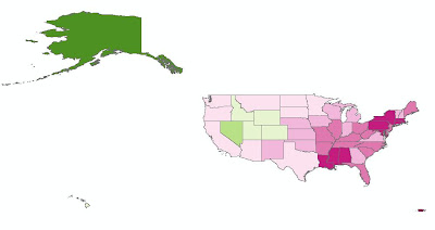
For our second map, we will create a map that shows the population density of the states in the U.S. The layer we are working with is still "States", but now we choose the field name "POP07_SQMI". For Classification type, Quantiles is chosen. For this map, a sequential color ramp is most appropriate. A sequential color ramp is suited to ordered data that progresses from low to high (or vice versa), and population density fits into this category. The final output has a color ramp from Light Red to Dark Red, with Contrasting Greys as the outline. You can see that the New England region has some of the most dense populations, while the Mountain region has some of the least dense populations.
The final map we will create will use the "% Females" as the field. To represent male/female populations, we will use a diverging color ramp. This type of color ramp is most suitable to use when there is a range of values with a distinct boundary between the low and high values. In this example, we will use 50% as the middle boundary, so that all the values above 50% will represent a female majority and all values below 50% will represent a male majority in the state. Unfortunately, ColorTool does not allow you to set 50% as the critical middle value. You are limited to selecting from the Classifications in the dropdown box (Quantile, Jenks, Equal Interval, and Unique Values). However, you can still go ahead create a map based on a quantile classification, and choose your desired color scheme. Then, in ArcMap, right click on the "% Females" layer and go to Properties. Under Quantities, and Graduated Colors, you can manually adjust the ranges of each color so that 50% will be represented by a neutral color (white), and the values on either side of 50% will graduate toward different colors. In this example, the states with the largest percentage of female population represented by a dark pink, and the states with the largest percentage of male population are represented by a dark green.
For more detailed information about the ColorTool2.0 application and its features, visit the online help system provided by the National Cancer Institute. A link for the help system is also located on the bottom of the Color Tool dialog box when you open it in ArcMap.
To download ColorTool, visit http://gis.cancer.gov/tools/colortool/ and follow the download link. You can download ColorTool 2.0 for ArcMap 9.2+ or ColorTool 1.4 for ArcMap 9.0 or 9.1. You will need to follow the Installation Instructions and then you will be ready to use ColorTool in ArcMap.
After embedding the ColorTool toolbar into your ArcMap environment, it should appear like this:


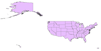
For our first map, we want to represent the U.S. as nine distinct regions: East North Central, East South Central, Middle Atlantic, Mountain, New England, Pacific, South Atlantic, West North Central, and West South Central. To start the symbolizing process, click the ColorTool icon. If you haven't already added data in ArcMap, clicking on the ColorTool icon will prompt you to do so.
The ColorTool dialog box will pop up, and the first step is to select which layer you want to symbolize. For this map, we are symbolizing the "States" layer. For FieldName, we choose "Region". Note that only fields with numerical values will show up in the dropdown box. For the classification type, "Unique Values" is chosen and include values for Regions 1-8. The next step—choosing the color ramp type—is probably the most important. In this case, we are only dealing with numerical data in the sense that numbers assign a region to each state. We want to represent different states based on the classification of region. So, to create the primary visual differences between regions, we can choose a qualitative color ramp. The next step is to select the specific color ramp that will be used to classify the layer. Colors are listed alphabetically and the descriptive label is followed by the ColorBrewer text code in parenthesis. For this map, the color ramp "Dark Variety" is chosen. Clicking on the Colors control will flip the order of the colors within the ramp. Now, the outline properties for the regions can be selected—in this case, black with a width of 0.4 is selected. Outline properties can be customized to any color and width desired. Sometimes, a useful option will be to select Contrasting Greys so that the outlines around the colors are different shades of grey that will contrast with the colors they surround. The dialog box with the settings mentioned above looks like this:

Clicking Apply allows you to see the output of your color schematic before committing to the changes. Here is what our map of the regions of the U.S. looks like:

Finally, you can check your ramp suitability to see if your map is color blind friendly, photocopy friendly, LCD projector friendly, laptop (LCD) friendly), CRT friendly, or color printing friendly. If there is a red "X" over one of the boxes, you can adjust your Color Tool properties until it no longer appears.
For our second map, we will create a map that shows the population density of the states in the U.S. The layer we are working with is still "States", but now we choose the field name "POP07_SQMI". For Classification type, Quantiles is chosen. For this map, a sequential color ramp is most appropriate. A sequential color ramp is suited to ordered data that progresses from low to high (or vice versa), and population density fits into this category. The final output has a color ramp from Light Red to Dark Red, with Contrasting Greys as the outline. You can see that the New England region has some of the most dense populations, while the Mountain region has some of the least dense populations.

The final map we will create will use the "% Females" as the field. To represent male/female populations, we will use a diverging color ramp. This type of color ramp is most suitable to use when there is a range of values with a distinct boundary between the low and high values. In this example, we will use 50% as the middle boundary, so that all the values above 50% will represent a female majority and all values below 50% will represent a male majority in the state. Unfortunately, ColorTool does not allow you to set 50% as the critical middle value. You are limited to selecting from the Classifications in the dropdown box (Quantile, Jenks, Equal Interval, and Unique Values). However, you can still go ahead create a map based on a quantile classification, and choose your desired color scheme. Then, in ArcMap, right click on the "% Females" layer and go to Properties. Under Quantities, and Graduated Colors, you can manually adjust the ranges of each color so that 50% will be represented by a neutral color (white), and the values on either side of 50% will graduate toward different colors. In this example, the states with the largest percentage of female population represented by a dark pink, and the states with the largest percentage of male population are represented by a dark green.

For more detailed information about the ColorTool2.0 application and its features, visit the online help system provided by the National Cancer Institute. A link for the help system is also located on the bottom of the Color Tool dialog box when you open it in ArcMap.
Monday, November 16, 2009
Miscellaneous Monday: Houston Area GIS Day
Houston Area GIS Day is this Thursday, November 19 at the University of Houston. The event will be held on the second floor of the University Center and is free for the general public to attend! The Exhibit Hall will feature over twenty exhibitors representing local government departments, as well as GIS software, data, training, and service providers. Half-hour presentations on a variety of GIS applications will be given throughout the day on the Main Stage in the center of the Exhibit Hall.
The keynote speaker at 9:20 AM will be Mary Gainer, a GIS Analyst and Project Manager for NASA Langley Research Center. Her presentation will focus on her work to preserve historic cultural resources at NASA sites using online GIS and virtual tours. Recently, Ms. Gainer has been appointed to expand Cultural Resources GIS (CRGIS) from the original project at Langley Research Center to NASA facilities throughout the United States, including Johnson Space Center in Houston.
For detailed information on the schedule of events, exhibitors, and event maps, please view the Program Guide. Don't forget to download your GIS Day Parking Voucher good for $5 parking at the UH Welcome Center Parking Garage!
Friday, November 13, 2009
Fun Friday: McDistance Map
Ever wonder how many McDonald's locations there are in the U.S or how far you live from one? Well someone has and they have helped others answer this question.
Below is Stephen Von Worley's visualization of the contiguous United States based on distance to the nearest McDonald's. He created the map using geocoded data provided on the AggData website.

You can read more about his inspiration for creating this map on his blog post. Currently, he is working on a series of close-ups, the first of which focuses on the Midwest.
Below is Stephen Von Worley's visualization of the contiguous United States based on distance to the nearest McDonald's. He created the map using geocoded data provided on the AggData website.
You can read more about his inspiration for creating this map on his blog post. Currently, he is working on a series of close-ups, the first of which focuses on the Midwest.
Thursday, November 12, 2009
Thursday Data: Houston Area Data Sources
For those looking for free GIS data covering the greater Houston area, there are several government organizations that make such data available for public download.
The City of Houston maintains a GIS website where users can download shapefile datasets. Each dataset contains numerous shapefiles grouped by category, such as administrative boundaries, locations, and routes. Unfortunately, it is not possible to select individual shapefiles out of the larger datasets for download. The data is updated and released every year or two. A new release was scheduled for this summer, but has been delayed.
The Architecture and Engineering Division of the Harris County Public Infrastructure Department also maintains a GIS website where users can preview and download individual shapefiles relating to reference grids, boundaries, transportation, water, parks and services.
The Harris County Appraisal District maintains a Public Data website where users can download both individual shapefiles and text files for import into Access databases, which can then be joined to the related shapefiles using GIS. Unsurprisingly, the best feature of the HCAD site is the ability to obtain detailed shapefiles and property information for all parcels in Harris County. The shapefiles were recently updated in October, 2009 and the data tables are updated bi-weekly.
The Houston-Galveston Area Council (HGAC) serves as Houston's Council of Governments (COG), or regional planning organization. HGAC supports local governments inside their 13-county service region and maintains a GIS Data Clearinghouse where users can download individual shapefiles relating to boundaries, cultural features, transportation, water, land, and elevation. Because HGAC serves a larger region than the Houston and Harris County governments, their datasets are typically more expansive in coverage. It is also worth exploring the numerous sections of their Regional Data & GIS Services website for information on demographics, economics, transportation, land use, and water quality in the region.
For members of the Rice community, we maintain several additional datasets for the Houston region at the GIS/Data Center that are not available online, including georeferenced historic and current aerial photography and LiDAR digital elevation models.
Wednesday, November 11, 2009
Web Wednesday: Make A Map
ESRI, the company behind ArcGIS software, has created an interactive web interface, called Make A Map, that allows users to create and share displays of basic U.S. demographic layers. Guests have the choice of seven different demographic statistics from which to make their map, each with a fixed graduated color ramp. As users zoom in on the map, the demographic representation changes automatically from the state level down to the county, census tract, and census block group level. Users are free to zoom to locations of interest (hometown, university, state, etc.), change the demographic variables, and embed their new map creation in their own webpage to share with others.
ESRI's main goal for this Web application is to "encourage you to freely create and share demographic Web maps," as well as to provide a quick and simple overview of some of the Web Mapping API (Application Programming Interface) technology that is becoming available. For more information about ESRI's other free mapping tools, visit Mapping for Everyone.
ESRI's main goal for this Web application is to "encourage you to freely create and share demographic Web maps," as well as to provide a quick and simple overview of some of the Web Mapping API (Application Programming Interface) technology that is becoming available. For more information about ESRI's other free mapping tools, visit Mapping for Everyone.
Below is an example embedded map showing the median age distribution of persons around the West University/Museum District area. Explore the map below and then make your own map to share.
Tuesday, November 10, 2009
Tuesday Tools: ColorBrewer - Part 1
One of the most important aspects of creating a map that effectively communicates information is an appropriately chosen color scheme. Colors used in a map are instrumental in displaying trends or relationships, and they ultimately impact how your map is perceived. Color selection is particularly important when choosing color ramps, which apply a continuous range of colors to a group of symbols on your map. ArcMap has predefined color ramps and gives you the option to create your own. Choosing colors is not easy for all of us, which is why ColorBrewer, a web tool for selecting colors for maps, is so useful. ColorBrewer facilitates the process of creating and testing customized, intelligent color selections based on the nature of your data.
An updated version, ColorBrewer 2.0, was recently released by Axis Maps. The new version has a larger selection of colors to customize the symbology of map features, including roads, cities, and boundary lines. You can also turn on a hillshade layer in the background and use transparency settings to see how well color schemes function as transparent overlays. Another new feature of ColorBrewer 2.0 is the ability to filter color schemes based on colorblind-safe, print-friendly, or photocopy-friendly settings so you can select which ones are suitable for the intended use of your map. The new version also allows you to export your color schemes into Adobe Illustrator, Photoshop, or Excel. Perhaps, the best feature of the new version is the ability to download an ArcMap plug-in, called ColorTool, which allows you to directly apply ColorBrewer color ramps to your own maps. Check back next Tuesday for more information on this free plug-in!
Note: ColorBrewer 2.0 requires Adobe Flash Player 10. If you can't download Adobe Flash Player 10, the original version of ColorBrewer is still available.

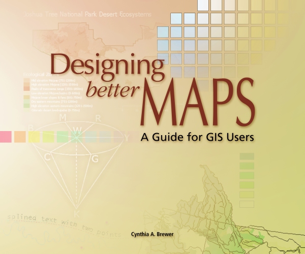
ColorBrewer's creator, Cynthia A. Brewer, is the author of Designing Better Maps: A Guide for GIS Users, which is available in the general stacks of Fondren Library. In addition to detailed information about map design, the book includes an appendix describing the ColorBrewer application, as well as printed color charts.
For hands-on training, Rice students, staff, and faculty have free access to ESRI's online course, titled Cartographic Design Using ArcGIS 9, which was authored by Dr. Brewer. Two of the seven modules in the course relate specifically to color design. Those wishing to take the self-paced, online course may log a ticket with Rice IT to request a course access code. Anyone may also purchase access to the course for $174.
An updated version, ColorBrewer 2.0, was recently released by Axis Maps. The new version has a larger selection of colors to customize the symbology of map features, including roads, cities, and boundary lines. You can also turn on a hillshade layer in the background and use transparency settings to see how well color schemes function as transparent overlays. Another new feature of ColorBrewer 2.0 is the ability to filter color schemes based on colorblind-safe, print-friendly, or photocopy-friendly settings so you can select which ones are suitable for the intended use of your map. The new version also allows you to export your color schemes into Adobe Illustrator, Photoshop, or Excel. Perhaps, the best feature of the new version is the ability to download an ArcMap plug-in, called ColorTool, which allows you to directly apply ColorBrewer color ramps to your own maps. Check back next Tuesday for more information on this free plug-in!
Note: ColorBrewer 2.0 requires Adobe Flash Player 10. If you can't download Adobe Flash Player 10, the original version of ColorBrewer is still available.

Color Brewer Version 2.0
ColorBrewer's creator, Cynthia A. Brewer, is the author of Designing Better Maps: A Guide for GIS Users, which is available in the general stacks of Fondren Library. In addition to detailed information about map design, the book includes an appendix describing the ColorBrewer application, as well as printed color charts.
For hands-on training, Rice students, staff, and faculty have free access to ESRI's online course, titled Cartographic Design Using ArcGIS 9, which was authored by Dr. Brewer. Two of the seven modules in the course relate specifically to color design. Those wishing to take the self-paced, online course may log a ticket with Rice IT to request a course access code. Anyone may also purchase access to the course for $174.
Monday, November 9, 2009
Welcome to the GIS/Data Center Blog
Welcome to the first of many blog posts brought to you by the staff of the GIS/Data Center in Fondren Library at Rice University. GIS stands for Geographic Information Systems and makes use of hardware and software to support people in displaying, querying, manipulating, and analyzing spatial data.
This blog will be geared towards the Rice community and will highlight resources at the GIS/Data Center and in the Houston area; however, most of the information will be equally applicable to anyone with an interest in or curiosity about GIS. We will be highlighting data, tools, techniques, and applications that we hope will be useful to those just getting started, as well as those with more experience who are looking for new and exciting innovations in the field. Therefore, our posts will feature a mixture of recent developments and well-established practices.
We've come up with some fun daily themes to keep you reading and us writing:
Miscellaneous Monday - general GIS news, Houston and Fondren Library GIS information and events, Rice faculty and student projects utilizing GIS
Tuesday Tools - tools that can be used online or downloaded to perform special functions in GIS and cartography
Web Wednesday - websites that either allow you to browse and query existing data online or to create online content using your own data
Thursday Data - sources of free, high-quality, GIS-related data
Fun Friday - interesting, novel, and downright fun maps and applications
If you would like more information or one-on-one training related to the any of the topics covered in the blog, feel free to visit us at the GIS/Data Center in the basement of Fondren Library (B40). Please also refer to our website for our contact information and more details regarding our computer lab, data, training, and assistance.
While comments will not be displayed on this blog, we do welcome your feedback and will take your comments into consideration for the future development of our blog.
Subscribe to:
Posts (Atom)